The Last Federation is a really unique game in that it is a strategy/tactics game set inside a simulation game. Check out our first sneak preview about it, or our preview discussing simulations in the game. Also our recent podcast with Space Game Junkie with lots of other details, the description of your role as an independent agent in the solar system, details on the alien races, and information about the “butterfly effect” in the game. Oh, and the forums for the game are filled with lots of other detailed tidbits, too.
Hey folks! I figured I would share some art with you today, although first I’ll share some various news updates about the game:
- We have now completely finished the design of v1 of the simulation of the game, which is really exciting. Coding on that is about 95% complete, and will wrap up probably by the end of the first week of January, thereabouts.
- As I mentioned on the forums in the discussion about the last post, I did find a way to make the Andors more interesting as a race. They went from being generic good guys to being waaaay over the top goody-two-shoes. They now provide a lot of unique and interesting strategic options for you, and also contribute to the butterfly effect in some really interesting ways.
- Writing-wise, Erik has been hard at work on all the text that the alien races have for different things, such as how they feel about you or each other, and what they say on “chatter” when various stuff happens. This really brings out the character of the races in yet another way, and makes everything feel more alive, which I’m very stoked about. I wrote generic lines just as stand-ins, but having everything said in-character for the various races is super fun. For instance, what the Thoraxians say about a race they hate due to war is really different from what the Burlusts or the Andors or Peltians say, even though they are all talking about the same thing.
- On the design front, we’ve now moved into the GUI even more heavily than we were before. Previously there were a lot of open questions internally about how to represent certain things, and now those are really getting narrowed down in a way that I find both exciting and relieving. They really let you get a good sense of what is going on in the simulation, and they let you do it in a way that isn’t just a bajillion overlays on one screen, but is instead using a variety of specialized screens to really show you information in the most concise and easy-to-understand format for whatever your question at the time is. Still a lot of work to go here, but it’s coming well.
- On that same sort of note, Josh has been working on “Intelligence” screens that are text-based, and which are kind of like advisers in Civilization or SimCity. These screens let you get at information on a specific topic in a text-based format, which is useful for both certain types of players and for certain circumstances. We’re doing this in-character as kind of a dry computer report, so that particularly makes me happy there, too, as that increases the ambience again. As with the extended GUI screens that Blue and I are working on, the Intelligence screens are really aimed at letting players answer questions that they have in as quick a fashion as possible.
And I don’t mean just new players: I mean when a player wants to know “what is going on militarily in the solar system lately,” they can either look at a text report, or they can look at a graphical representation. This is important because just looking at the current state of things doesn’t always tell you the entire story.
It’s like with SimCity: you can look at your current state of your city, and that tells you a lot. But you need overlays for things like fire and water coverage, for instance. And if you want to know what your utility usages have been over time, or budget over time, then there are graphs for that. These things all help you answer very critical questions, and arguably you could not play the game very well without them, even though technically you spend most of your time in the main city view. Same kind of deal with TLF.
- On the art front, Blue and Cath have really been ripping it up in general and are doing their best work yet, and quite quickly as well. The original scope is pretty close to being done, and so we’re getting into a lot of the nice-to-have elements that I had hoped to be able to do but was not sure we could. That’s really pleasing to me, because that really helps us extend the sense of place and of variety further. Versus just seeing tiny graphics for the various planet types and having to imagine what is there, actually seeing a couple of views of them that stoke your imagination even more.
- With all that said, the outstanding GUI stuff and our need for internal testing pretty much mean that the alpha can’t start until mid-January, as opposed to early January. We really can’t let it go any further than that, because we want to release the 1.0 of the game in mid-February (and really, there is no good reason at this point we should not be able to). Anyway, so that’s what is up with the schedule. We’re aiming to have things in a really advanced state by the time alpha starts at all, so that we can have a (comparably) relaxed month-long alpha like we did with Bionic Dues, versus something more rushed like Skyward Collapse was.
Okay, so here’s some art!
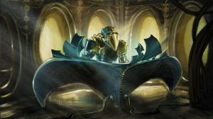
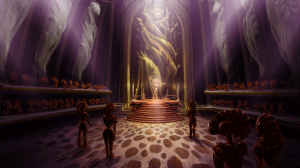
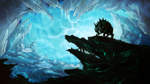
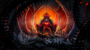
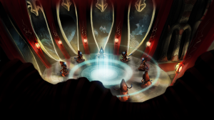
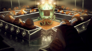
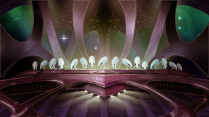
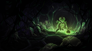
First off, all of the alien political screen backgrounds are now fully complete — colored and everything. Way to go Cath!
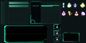
Next up are some random GUI elements in a working document. This isn’t complete, but it does give you an example of the overall style that a lot of the game’s GUI will be, and how much more detailed is is compared to our other games. Also it shows the awesome alien icons in their completed format in the upper left. Blue did a really tremendous job with this!
I wish I could show you some screenshots of combat, but that will need to wait until early January. The actual artwork and design work on that is all complete, but we haven’t had time to code it in yet, and the design palette windows don’t have all the elements quite arranged as well as they will be in the actual game. But suffice it to say, I really love how it looks.
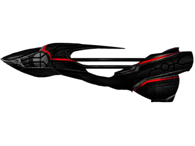
All of the in-game ship hulls are now done as well. There are 30 overall ship hulls, although each one of them gets used for a variety of procedurally-generated ship types that are unique to each particular playthrough. Blue and Cath did all of these together. Here are a few examples:
Bear in mind that all of these ships are shown with red running lights, whereas in the game itself that is not the case. Normally the running lights have their color shifted based on what their race is, or if they belong to your mercenary fleet. We’re doing this with true hue shifting in this game, versus the diffuse coloring that we used in AI War. It makes it so that we can do some really fancier effects, as you see above. Basically the quality doesn’t drop or get darker, the color just shifts on the spectrum.
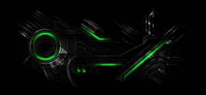
For example, this is the actual color that your flagship (and your ships in general) use:
It’s the same graphic that I posted above, just using the in-game HSV shift. Note the lack of quality loss.
Anyhow, that’s it for today. Enjoy!






Hopefully this wont be steam-only DRM like Bionic Dues.
Likely this will be steam only, as we simply have no way to do updates on Linux outside of that. That said, we don’t actually use any drm of steam’s so you can take the files it downloads and move those where we you want. There is no hook into steam that is required, it’s just a downloader tool.
You could always do Humble Store or widget for DRM-free. They deal with Windows, Mac, and Linux.
I think Desura does too. Maybe Shinyloot, idk.
Steam is DRM.
I can’t wait to play it! The blog’s article appeal to me ;).