It’s been exactly a month since my last post of WIP art on AVWW! Fear not, it’s not because not much has been going on — it’s because a ton has, but we can’t quite talk about it yet. That said, the art is proceeding really well and I thought I’d share these bits of them that are particularly far along.
First of all, we have the above mockup of what the new game will look like. The idea with the mockup isn’t to actually create assets to use in the game, it’s instead aimed at defining the style that all the other art will be finished as. Much of the art that is currently in progress is currently at the sketch or coloring stages, but what this mockup is defining is how exactly the final shading and stylization will be.
The enemy is obviously still at the sketch phase even in this image, but the Celes character looks really amazing at this point, and the backgrounds and general style of the rest of the image does as well. I’m extremely jazzed with how this is turning out.
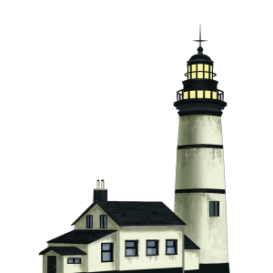
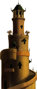
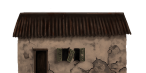
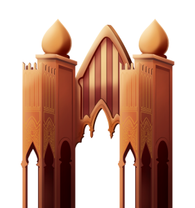
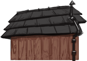
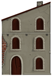
Now that you’ve seen a mockup of how everything is intended to look when tied all together, here’s a few more images that are either complete or very close to being so. Most of the focus thus far has been on the buildings and to some extent on the backdrops, but as of last week the major focus has changed to being on the characters.
Bear in mind that these are at varying stages of completion, so the level of detail in all of them doesn’t quite match yet. But it will!
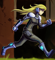
Getting the style for the characters exactly right has been a challenge, because we were looking for something that would work with the style of the background elements without being too muddy or similar. As you can see from the mockup above, here’s what we’ve settled on:
It’s a bit of a cartoony look, but with shaping and shading that fits with the backgrounds while still making the characters “pop” off them. That’s really great for being able to quickly find your character in the scene, as you can see demonstrated in the mockup at the top of the screen. But at the same time, the character doesn’t look out of place in the scene.
I take no credit for figuring this out; the artists and producers at Heavy Cat know their stuff!
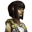
As part of the work on the art-revamp-plus-other-changes, we’re going to be introducing 24 all-new character models to the game. Celes, above, is one from the modern contemporary period. Tiyi, below, is from the bronze age:
Each sprite will have two different portraits to help to differentiate individual characters who use the sprite more from each other. The actual final styling of the portraits will be more like the Celes sprite above, but what you’re seeing with Tiyi there is a near-final version of the portrait that has everything except the final stylization.
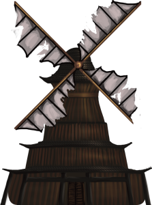
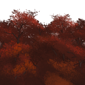
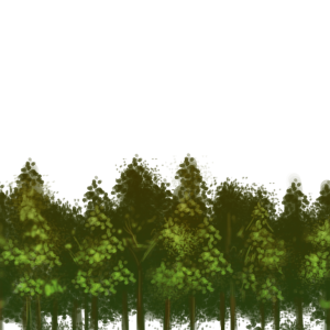
The parallax backdrops show behind the layers of buildings and foreground objects, and help to provide a sense of place. One of the things we’re also working on with these is to help provide more of a sense of depth in the new versions — something that my art skills were definitely not up to in the original versions of the art. Here’s a few selected WIP images:
And that’s it for now!







I personally liked the old art style, but that stuff is pretty sweet
Looking amazing so far. I’m with Adam and I love the original style, but even so the new art direction looks amazing.
I thought the original art style was amazing. I had never seen anything like it – not just in video games, but artistic direction regardless of medium.
I even had a deep appreciation for the wonky attack animations. The bizarre poses done while attacking had a quirky charm about them.
Some people knock how the game’s appearance lacked uniformity. I always felt that the immediate incongruencies were only as jarring as a patchwork quilt with all of it’s bohemian charm.
The previous look really made me feel the concept of an existence comprised of tethered together realities. I never bothered to read any of the text in the game, because the look alone made me feel a ramshackle cohesion of the ages more so than the stabs at lore.
It was a very refreshing design choice, and the fact that it was almost universally panned by critics showed me just how little I actually value the opinions of the better known reviewing sites.
So, I’m really bummed out that things are changing. I mean, the new art is interesting enough – it should garner more wide spread acclaim, I think. And I am able to stand behind it if it draws more support for Arcen.
However, I feel a huge personal loss knowing that the cartoony style is going to be replacing the one that I have come to really love. And I’ve got nothing against cartoony styling when it’s innovative. But for AVWW, it just seems like an effort to be more widespread.
The cartoony stuff for Valley 2 is acceptable, because it’s a different game with more direction to it. The metagame has more initiative and the narrative of the game has a more traditional adherence to story telling conventions (there’s a beginning, middle, and end; there is one well defined villain).
I am sure that Valley 2 will shape up to be a great game. I have been with AVWW from back when it was supposed to be an isometric game – so I am well aware that Arcen can make drastic gameplay changes for the better. I have approached all of the AVWW updates in anticipation. And whenever I see a new Valley 2 update, I try it out, hoping that it can pull me into the game like AVWW.
But Valley 2 is just too directed for my liking. AVWW is the kind of game that’s well suited to just idling about in a happenstance mosaic of gameplay elements, something well reflected in the art.
Valley 2 is more of a conventional game. Or, rather, it’s much easier to say what kind of game it is. I’d say that it’s a side scroller with a strategy metagame. I never feel like I do justice to AVWW unless I call it anything other than a game where you walk around and do things at your leisure.
Again, I’m sure a lot of people will say that this is for the better. I just wanted to put out my own selfish views.
In an ideal world, we’d be able to keep both art styles, and switch between them on the fly – but I was reading how unlikely that would be on account of hit boxes being modified and the like.
My apologies! I misread – or, rather, I didn’t read enough! I just learned that Valley 2 won’t be replacing AVWW. It’s a bummer that AVWW won’t be getting new updates, but it’s nice to know that the game won’t be being “overwritten” by Valley 2.
Best of luck on Valley 2! I will keep on trying to get behind the game like I did AVWW. The continually improving gamepad support has gone a long way to keep me hopeful.