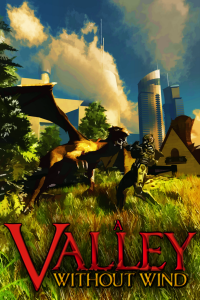
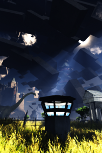
I’ve been working on doing some new concept art today so that we’d have a better boxart image than the old one, which has been feeling embarrassingly lame lately. Here are the first two that I’ve created, and I plan to do at least one more in the next week.
The second one at the moment is the one that I currently plan to use as boxart unless I come up with something better; while I do like many aspects of the first one better, the second one looks better when reduced (which, selling online, is what people see most of the time).
UPDATE: It appears that these weren’t quite as ultra-high-res as I’d originally intended. I uploaded 2200×3300 px images, and blogger sized them down substantially. Oh well, these are still really large.


