Since the game has gone through so many graphical improvements in the last few weeks — first GUI, then the skies, and now the HUD — I thought I’d post some before and after screenshots.
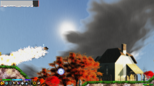
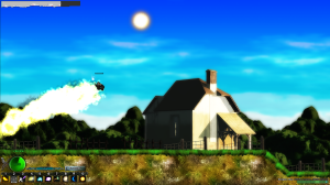
Here’s the first pair:
This one I managed to get pretty close between the two versions: both in grasslands areas, although the top shot is actually grasslands with groves; and both even show the same spell in use and the sun in a similar position, and the same building on the screen.
Note how much more colorful and vibrant the skies are since we moved away from the old style of “dynamic and static” split skies and into one unified animated sky system. Also note how crazy much better the HUD looks, if I do say so myself. All in all these screens do a really good job of showing how much more cohesive the art style has become as we move toward 1.0.
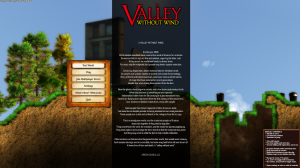
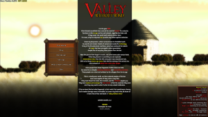
Now the next (and last) pair of screens to show you:
These two versions of the main menu obviously aren’t as close as the first screenshots were. But since we already had a pair of shots of the grasslands above, I didn’t just want to repeat that here.
So now you see the desert — and again, note how much more vibrant and personal the sky is compared to before. All the skies before tended to look very similar, just with some color variations between areas. Here the clouds and everything actually look different, and the animations are really different in each one.
Also of note is the awesome new GUI that Phil did fo the game a while back, and which finally made it into the game a month or so ago. And then this also really shows off the difference between the older style Unity text and our newer sprite text, as well: we’re able to do colors and borders with ease, and everything looks more polished and easier to read in the new fashion.
Even the logo has been updated to look more stylized!
Anyway, we’re hitting the home stretch now as we moved toward a version 1.0 hopefully hitting in March, and I wanted to do a post that showed off just how much has changed graphically about the game.


Looking good ^.^
Dang. I was gonna say Looking good myself. 🙂
🙂 How about very, very Cool! 🙂