Chris here! Okay, so this is a whole lot of random stuff from the last month, and these are some of our internal videos that I did a quick vetting of and figured were safe to release for those people who might be interested in them.
These are all unlisted on our youtube channel, to not clutter that up with this sort of thing, but if you’re interested in the development work side of the process (technical or art or otherwise), here’s some meat for you (in chronological order):
December 10th, 2016: Chris rambles about custom editors for Keith, but generally fine to show for whoever.
December 5th, 2016: Notes for Keith, specifically aimed at showing what was done in AI War Classic so that he could replace it with something much better for AI War 2 (via Forge Networking).
January 16th, 2017: Quick visual mockup for Blue (artist) of unpainted model of my rough (VERY rough) concept for the Ark for AI War 2. This is incredibly ugly in a lot of ways and is meant to be a bit of a “throw together some legos as a 3D concept” sort of thing.
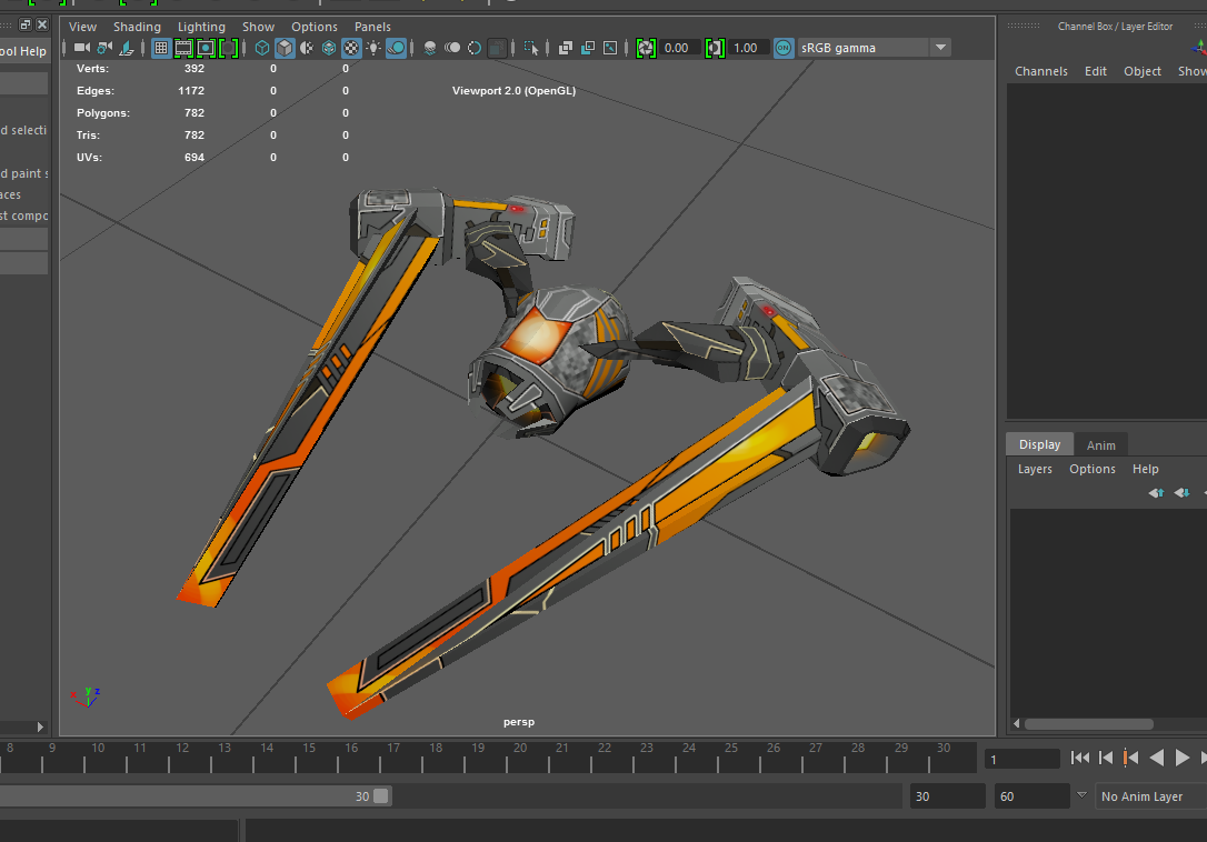
She then takes it and makes it into something that is actually awesome, which is work that is currently in-progress as of the time of this post (though there are some screenshots from Maya).
Warning: this is very much “how the hotdog is made” in terms of the nature of the video!
January 16th, 2017: Notes for Keith on some craziness that happens with external DLLs and moving the cheese on unity, plus how to re-link assets that become unlinked.
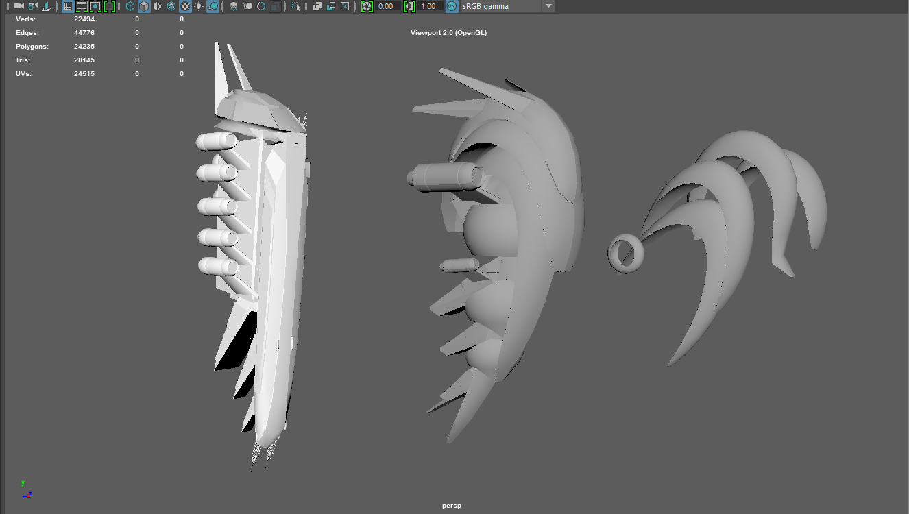
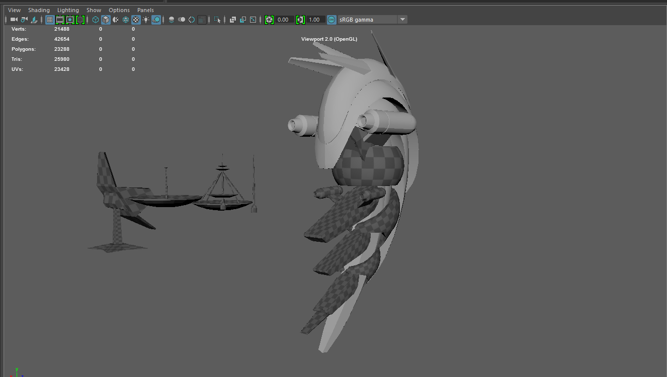
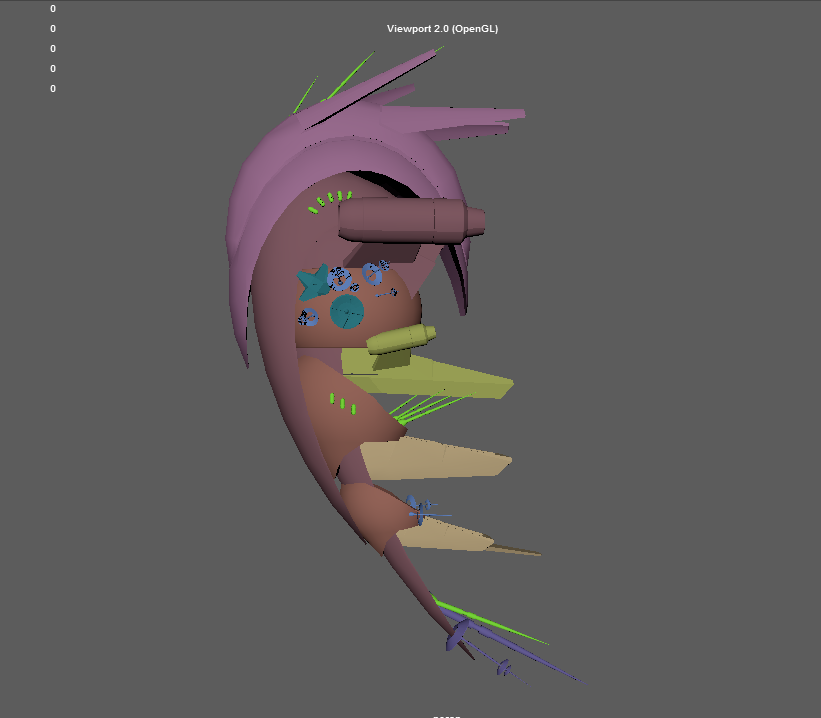
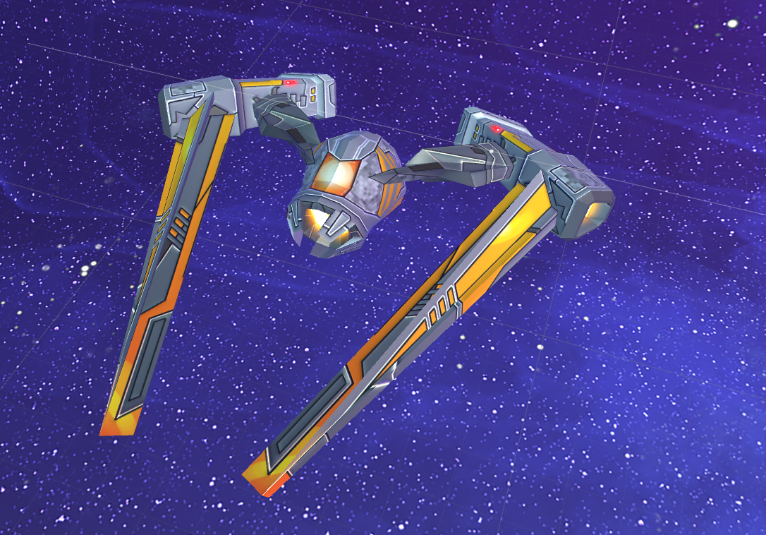
January 17th, 2017: Here’s are some progressive screenshots from Maya of what Blue (artist) had done at that point (very very incomplete) and how her work was evolving from mine.
On the left in the first shot is the terrible mockup fbx file I created, and then in the center is what she was evolving that into in broad form:
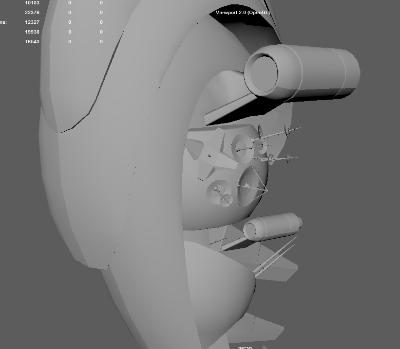
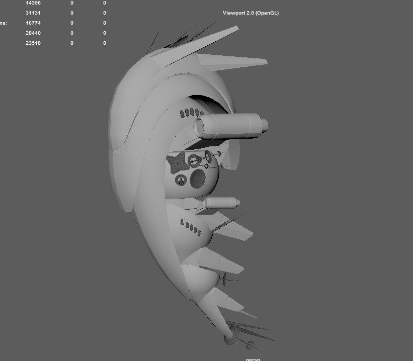
Then later that day, two more shots of the Ark.
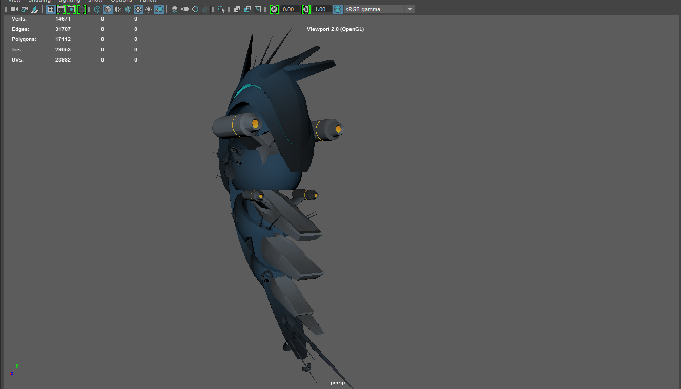
January 18th, 2017: More screenshots from Maya from Blue’s work, where she is basically done with the model itself. She notes “I left all the small bits in grey-checker so you can distinguish them from the main ship.”
A few hours later that day, more stuff (in false colors). She notes: “UV’s done and organized. Each color indicates a set of UV’s. So if they share a color, they share a UV set. So there will be 8 texture sets.”
And then actually painting those uvs in Photoshop comes next, and is currently in progress. 🙂
Here are the flat colors, actually, with her notes: “I haven’t done any of the detail work yet. Just laying down the base over all.”
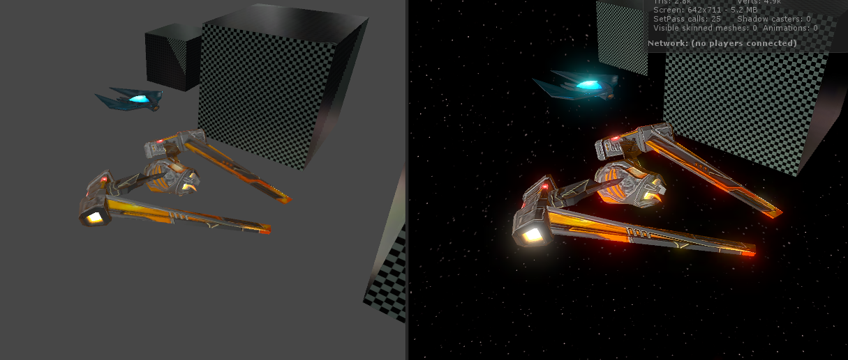
January 18th, 2017: Quick visual mockup for Blue (artist) of unpainted models that may or may not be used, with the general idea of the motion they would have, and the vertex-animated internal model for the “wormhole” inside the AI Warp Gates for AI War 2.
Very very rough, and not meant to be any sort of final product.
January 19th, 2017: Notes for Cinth on setting up LOD groups and otherwise optimizing the particle effects for AI War 2 to keep the framerates high.
Visual Evolution of the Bomber
This is out of sequence because it happened over the course of many days throughout this whole process, but here’s an interesting look at some of our workflow.
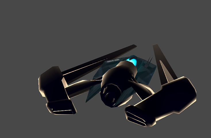
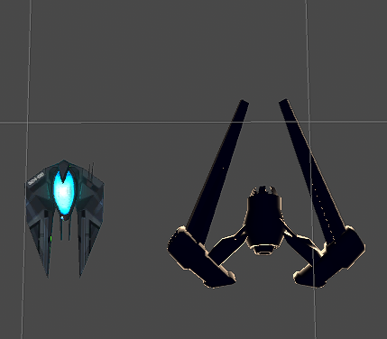
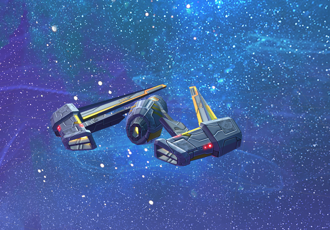
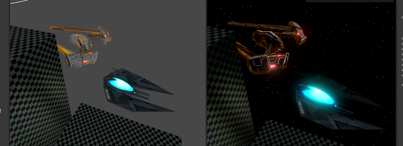
I gave Blue this reference bomber model to work with that I had created, but it was messy and needed a lot of work, and had no textures yet:
In the above two, it’s shown next to the fighter for scale.
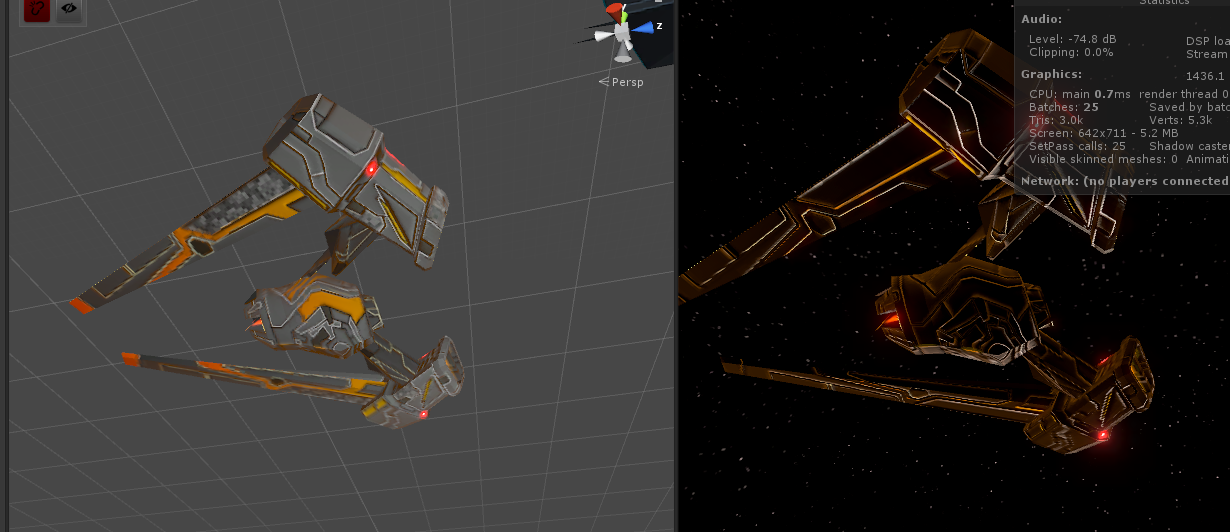
She then had to do a lot of fixing of the model, which is a process we’ve decided to scrap because it’s much easier for me to create a rough approximation with notes (ala the Ark, as seen above), and then her to create the final model from scratch herself rather than trying to repair my wreckage. Nonetheless, she spent 3ish hours repairing the wreckage of my bomber and made something awesome out of it:
Note how crisp all the lines are, although it’s not yet having a proper shader, and it looks washed out, etc. This is to be expected. Generally once I pull it into Maya and apply my shaders and tweaks, it is basically the final touches that turn it fully awesome. The post-processing effects and bloom and her emission maps help a lot with that, too, to be sure.
But this time, there was a problem. I set it up, and did so like this:
Grooooosss! While the lighting and so on is cool, there’s a lot up there to hate compared to the original model. She noted there was some quality loss, and I wasn’t sure specifically which things she meant, so I pointed out the following possible areas:
With some detailed commentary on each area that are not worth repeating here. At any rate, I made a lot of tweaks to the shaders, and we got to this:
Muuuuch better. Still needs work, though.
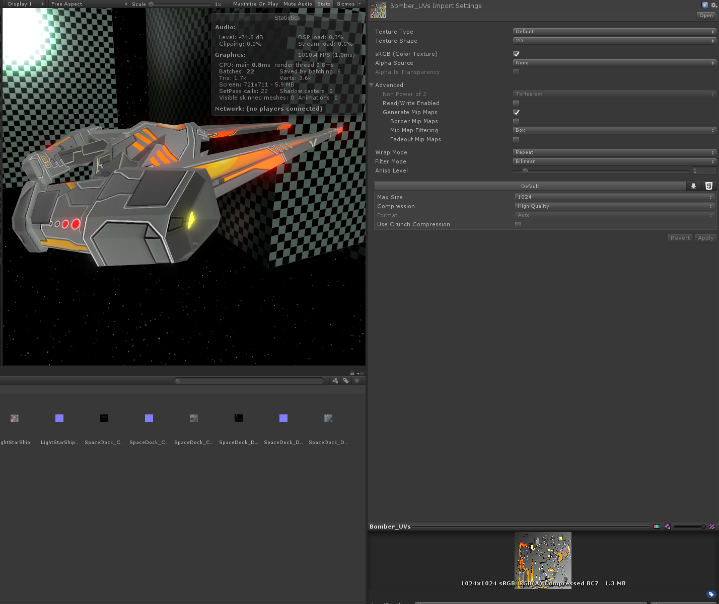
She finished her tweaks to the emission map and the albedo texture, and I figured out some big improvements on the texture import side (both quartering the VRAM used by the bomber as well as improving its crispness), and we arrived at this:
Biiiiig difference.
That’s It For Now!
Just a lot of random notes, since we’ve been quiet. There was a ton of other stuff happening as well, but this gives you some idea. 🙂
Cheers!
Chris









I’m surprised the initial kick starter basically doubled its original monetary goal. It’s amazing to see how much progression has been made. Leaps and bounds, this rts game has began to come together. In addition seeing the some of mockup concepting was interesting. Especially seeing the the addition of more intricacies and then seeing what could be looked at a prototype.