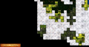
Not a full developer diary today — but I did want to share a couple of things since it’s been a while. We’ve got a few full diaries with videos and lots of details coming up before too long, but in the meantime there are a few things that I can show well with screenshots.
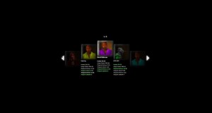
New Character Select Screen
The new version uses a fancier way of letting you scroll through your options, plus it also uses the new character portraits. In general this is one of several examples of how Keith and I have been retooling the various interfaces to be less spreadsheet-like and more visually pleasing.
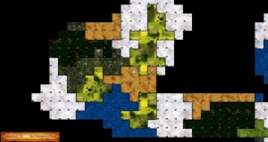
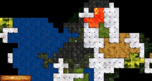
New World Map Visuals
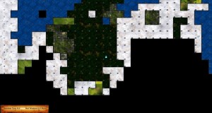
Yet again, the world map visuals have been redone. This time it’s to make it less boardgame-like and more like a 4X game. This also shows off the new ocean tiles, as well as some of the generally better seeding logic. The world map is getting pretty close to being final for beta, now:
If you’re curious about the ocean tiles: yes, you can move onto them. However, like some other “hostile tiles” you get sucked right into them. If you’re on a “shallows” section of the ocean (you can pick them out, though they are subtle differences), this isn’t a crisis. There’s a lot of dangerous water in the shallows, but also land for you to walk.
If you’re not in the shallows… well, your character can’t swim. You pop out in the middle of the ocean and start sinking fast. There are ways to cross the ocean in this manner, but I’ll leave you to discover those in-game when it hits beta!
Until Next Time!
This is just a brief little bit of info, but we’ll have a lot more to share next time, including some longer gameplay videos that let you see more how an actual gameplay session might feel.

