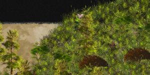
Figured out a lot of stuff today for improving the art, and actually improved the framerate massively while I was at it. See above, and click for the fullsized screenshot (from the Unity Editor) if you like.
Instead of rendering quite so many short, tame grasses, I’ve taken the original renderings that I did and re-processed them at 4x the prior size, leading to a far more detailed (consistent with the rendered trees) look. It’s also something that comes up to the character’s chest, rather than his ankles. I figure that if these wild parts of the world are meant to feel post-apocalyptic and intimidating, the plants would really be taking over even more than I’d had them doing before. And this is now much more like what I’d been imagining from the start, anyway.
The plants by the skyline are also similarly improved, and the alien-like strange reeds that pop up every so often near the cliffs in particular look even freakier. I didn’t re-render anything, I just went back to my source rendered images and then scale and post-processed them differently. Even the post-processing is mostly the same technique, but it’s applied in a slightly different way and has one critical new component: KillWhite.
Topaz Labs got back to me about their filters not working the way I want with complex transparent borders, and basically said that it isn’t possible at this time, but that they’d talk to their dev team about it to find out if it’s a possible new feature. I thought that was quite fair, but needed to find a workaround (or permanent solution, even) in the meantime. The Topaz filters work just great for things that I do want to keep the hard border on, of course — objects and characters, for instance. It’s just when I want that painterly style all the way up to the edge of a plant that it gets troublesome.
But, KillWhite allows me to do the compositing and filtering on a plain white background, and then lift the white out afterwards. When I have white elements that I need to preserve, I either have to have a duplicate layer for that part of the image (as with the birch tree trunks), or I temporarily invert the color of the object itself and then do the on-white processing, and then invert the color back (for the purple/white reeds shown above).
The end result is something that has the painterly styling all up to the edge, has much more natural edges in general, no longer has the white halo effect that makes it look like a magazine cutout, and has a graduated alpha feathering at the edge that gives the trees a slightly more three dimensional look. Awesome. I re-processed every plant and tree in the game using the new tools and technique. As you can see in the screenshot above, the result is far superior.
We’ll have a full batch of new screenshots later this week (showing off the first magic spell, too, actually — among other new things), and I’m sure a new video, too. But since there had been some concern over the other screenshots from some folks, I wanted to go ahead and share at least one new one early.


Looking good!