In my last post about Bionic, which was actually earlier today, I said that I would soon be posting some actual in-game screenshots of Bionic Dues. I bet you didn’t think it would be this soon! Anyway, I’m really excited to share these with you.
Click for the full-size versions of all of these, and bear in mind that these are jpegs so there is a little bit of lossiness to the images (but not much).
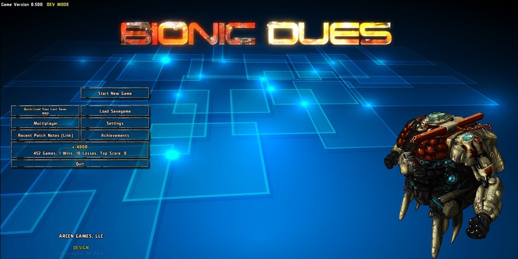
Above: The title menu. It’s pretty much what you will see in the final 1.0 version of the game, I think. The exo portrait on the right is different every time you start the game (out of the pool of 6 epic exos).
Above: The “start new game” window. This is definitely final in terms of what you will see for the 1.0 version of the game. You choose your city map type, your team of four Exos, your commander, your difficulty, and if multiplayer is enabled or not. And you’re off to the races!
– The city map type gives you a different visual, as well as different node positions and connections. In even a single city, however, the placement of all the nodes is completely random, as is where you start in the city.
– Your team of four exos really determines the feel of your entire game. If you choose four Science exos… well, that’s going to be a really tough game! That’s like the “four white mages” run in Final Fantasy 1, I’d say. But going without any science guy at all is also probably not the best plan. One tank, one science, and two of anything else is usually wisest.
– Your commander gives you some sort of large single bonus throughout the game (and that’s all they do, to be clear). In this case, Meg is selected, and she gets 50% better loot than usual, as she was formerly a mechanic. There are six commanders, and they all have abilities that are hard to choose between because they are all so desirable.
– The difficulty level determines three things: 1) how much health your home command has before it blows up and you lose the game (ie, how many missions you can fail); 2) the starting amount of and rate of growth of enemy robot manufacturing (higher is bad); 3) the starting amount of and rate of growth of your scavenging prowess (higher is good).
Above: Both the city map and the mission map can be zoomed in and out to a huge degree. Here we are all the way zoomed out, and we can see most of the city in one view. That said, we’ve only just started this game, so very few of the nodes are visible at all (just 5 out of 125 are visible, and then a further four are noted as “potential missions” that you will uncover if you complete a mission adjacent to them).
Above: And here we are now completely zoomed in. Also I hovered over the home command health indicator so you can read that tooltip if you want.
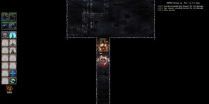
Above:”DumBots” are the basic foot soldiers of the game, and they have, shall we say, “Storm Trooper Aim.” They always miss their first shot, and their shots don’t hit for much anyhow. But the thing is, unlike in the movies, when you walk into a room full of 20 of these, you are actually in pretty decent peril.
You’ll want to draw them out for single combat if you can. If only there were a way to attract their attention without going into their direct sight range!
Above: Further down the same hall from above, we find a BlunderBot. These guys have rocket launchers, which this one just used to destroy my Epic Assault Exo. This is the second robot I’ve met this mission, incidentally, and I was stupid in how I approached him and so am down an Exo already.
The BlunderBots are an interesting breed, because they only have one rocket, and then they become a nice doorstop that fouls up the travel lanes of other bots. Useful! Also, their tooltip description, thanks to Keith, is hilarious:
BlunderBot: A Siege bot that often gets a bit distracted. This is at least as bad as it sounds.
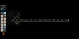
Above: Different mission, same city. This time I lost my Science bot, mainly because I was stupid and did not pay attention. So I’m using my Siege Exo at the moment. You’ll notice that he isn’t lit (and also not animated) yet, unlike the other Exos. That bit is still a work in progress.
You can also see the fog of war as well as the sensor range. There are four levels of perception: never-seen-before, seen-but-in-fog-of-war, in-sensor-range (lit up and visible), and line-of-sight (can shoot at and be shot by). You’ll notice that the sensor range extends in a “flood fill” style behind me, rather than being a Cartesian area. You’ll also notice that most types of doors (glass doors and automatic doors excepted) block sensors.
There is also the purple crosshair thing in both this image and the one below — that’s marking where the boundary between the never-seen-before areas of the map and any other status. That way it’s super clear where to go (and those crosshairs are actually nicely animated color-wise in the game).
Above: Third mission, same city. Everyone is alive! I haven’t done anything stupid here. In fact, since these are just DumBots, I’m using my Science Exo to whistle and draw them out for easy smashing. If I were just a little smarter and stayed back two tiles, I could do this without taking any damage. But whistling here is a good move at least.
If I kill the top guy (who is alerted already) first, then back up and then whistle, then I can probably still come out of this with no damage taken.
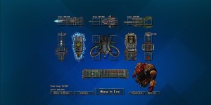
Above: The three major components of this game are the city view (where you make your long-range decisions by choosing which missions to undertake), the mission view (where the direct gameplay is undertaken), and this — the Exo customization view. You’ll spend a goodly bit of time here.
Above: On the prior image we were looking at a Tank Exo, and you can see how its slots vary from the Epic Assault Exo (this is the upgraded version of the regular Assault Exo; there is an Epic version of every Exo type). The Epic versions usually have more guns and other customization slots.
In the center area you have the shields (left), reactor (center), propulsion (right), and then the computer (below). Normally the number of slots on those would vary by the type of Exo, but that isn’t being coded until tomorrow.
Anyway, this gives a pretty good sense of where the game is at at the moment, I think. Thanks for reading! 🙂









Wow! Can’t wait, looking like your best game since AI wars (I’m a big sci-fi space/mech fan, so don’t take offence to your other games, because I love AVWW and Skyward collapse as well).
This may very well be my favorite Arcen Games game (err?!?) yet.
I’m looking forward to all the little teasers you’re going to show us until we get to play it.
Thanks for making such awesome games!
This looks like a mixture of FTL and more classic roguelike elements with exploration and more focus on items and equipment. Super digging it so far.
Keeping my eye on this for the new 2 Girls 1 Game video series, once you guys release.
Keep it up!
Nice!
Btw, did you consider using 3D models rendered to 2D scene? It might look even better.
What UI render engine to use for your games? DirectX.Net?
“Btw, did you consider using 3D models rendered to 2D scene? It might look even better.”
Not really; that tends not to look as good as people think. See Valley 1 as an example, as that’s the approach we used there. Also, our artists at the moment are geared around hand-painting anyway, so that’s going to be our style from here on out.
“What UI render engine to use for your games? DirectX.Net?”
We use Unity 3D for all our games these days, but not much of their render pipeline: we go down to the bare metal in their engine rather than using any GameObjects or whatever. Their “bare metal” is cross platform and comes with an awesome shader model, though, which is why we like it so much. 🙂
@Everyone else: thank you for the kind words! We’re really excited to share this with you as soon as we can. 🙂
Really really cool looking – I look forward to playing this game.