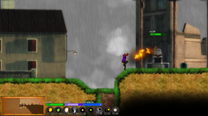
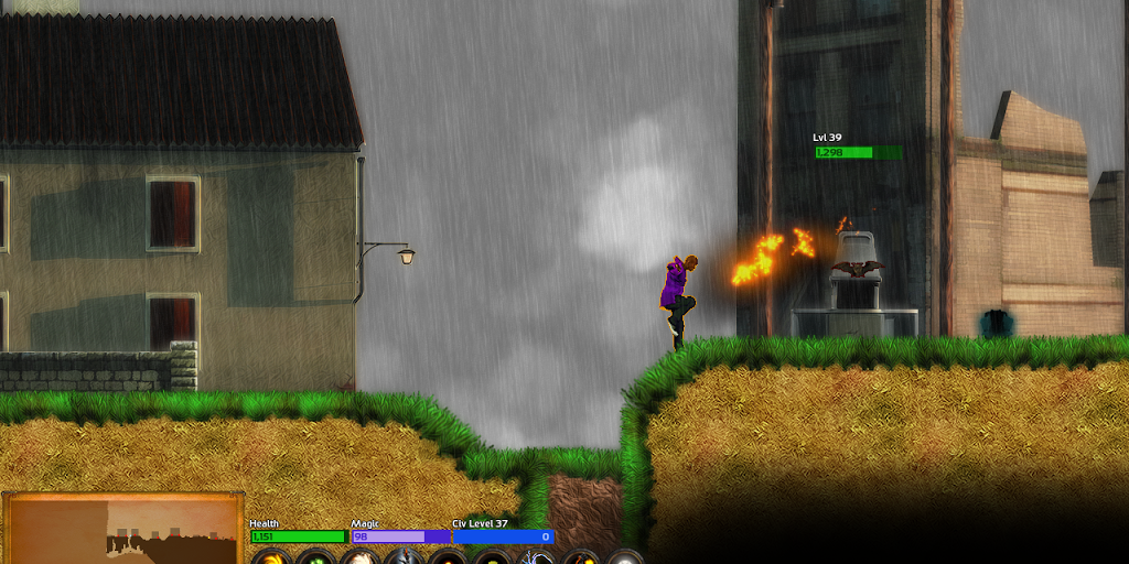
There comes a point in every good game’s life where it stops feeling like a prototype, and starts feeling downright fun. For AVWW, that time is now, and it came about because of a fundamental shift we made to the game: rather than being a top-down 2D game in a faux perspective that is common to SNES, DS, and pixelart games, it is now a side-view 2D game. It’s still a sprawling adventure game in an infinite world with a top-down overworld map, but the perspective of the actual action-adventure bits has now flipped.
 It’s amazing how obvious this change seems in retrospect: it fits perfectly with the rest of the game’s design, and in fact augments it. There was recently a three-page feature on AVWW in PC Power Play, and literally the only thing that’s now outdated in that article is the screenshots. Settlements, crafting, hopes, deeds, NPCs, and so on have been completely unaffected by this shift.
The perspective change has been a unifying force for the art as well as the gameplay, while ditching the camera angle that was bothering so many people in the previews. All of the individual graphics in the last video diary were high-res and attractive, but the overall composition was never able to gel until now. I find it really telling that when our PR guy Erik saw an early side-view build, his first comment was to compliment me on the new art — and that was before I’d changed any significant portion of the art he was seeing.
The traditional faux top-down perspective blends elements that are side view and elements that are top-down and elements that are partway between; this works with pixelart, which is more abstract, but really bothers people increasingly as you move into higher res stuff. So what Erik was seeing was all the side-view stuff that I hadn’t even changed, just with the top-down stuff lifted out. Scene composition counts for a lot, as any photographer will tell you.
Keith and I originally talked about making a switch to side view on the day after Christmas. I felt like it would give an enormous boost to the art, but Keith worried that the game would feel more arcade-like in a bad way, and I was worried that I wouldn’t be able to implement the sort of tactical combat that I was hoping for. Just when I had convinced Keith to do it, I flipflopped and we stuck with a top-down view. It’s funny looking back at those emails now. On May 27th, after months of trying to make the top-down view work, I finally realized that the side view was what we needed to do. Blue’s News has been calling it a side view game every time we do a dev diary, so I guess Blue has a pretty good crystal ball!
Part of what convinced me that this was the right direction to take the game in, and not just for art reasons, was the evolving design of the combat. I wanted a reasonably tactical gameplay experience, but in realtime that comes down to the choices that you make more than battlefield position. Location changes too rapidly in this sort of realtime game to be a substantial force for tactical maneuvering, so the bulk of the tactics come down to what abilities you use, and when, and in what combinations. And I realized that would be absolutely killer in a side view game — as a kid I had a special love for side scrolling games such as Zelda II, Faxanadu, Ironsword, Metroid, and Castlevania II.
 It’s the sort of game design challenge I just absolutely salivate over, and I think we’ll have something really fresh and exciting even by beta. The last few weeks have been euphoric for me, as this one simple change just solves so many problems that had previously seemed intractable. Even Keith, who really doesn’t like twitch games or platformers, has been remarking on how much more fun the game is lately, which I take to be a very good sign.
Also in the time since the last developer diary, we’ve added over a hundred new objects to the game, a handful of new spells, several dozen new buildings, and several new animations. Oh, and we’ve added chains of underground caverns, which are a major new thing. This means we’re getting started on vertical development in a major way. However, at the same time we managed to completely redo the inventory interface, get most of the work done on an all-new crafting system, redo the bulk of the art that we already had, do all the new physics for the side view mechanics, and in general convert over all the adventure-related and graphical-related code so that it is now side view instead of top view. That’s exactly as much work as it sounds like.
The result of this side view switch is something that looks incredibly better, that’s orders of magnitude faster for us to create, and that’s more fun to play. It also helps give a much stronger sense of place: partly it’s seeing the sky when you’re outside, but it’s also the varied terrain height, long falls, poison water, and so on. There is more interesting stuff visible on the screen at all times now, but amusingly the new perspective is still about three times lighter on the graphics card thanks to not having to render quite so much grass; my average framerate is now about 250fps instead of 80fps.

Rest assured that we’re committed to the same “easy to get into, but incredibly deep” gameplay that we’ve been talking about since the start on AVWW. The last few weeks we’ve been making huge strides along that very path. We look forward to sharing even more of our progress with you over the coming weeks, and we expect to hit beta in early August. Player feedback has been instrumental for us in helping to polish this game and particularly to make the perspective shift — that’s something I can’t emphasize enough. People tried to help us improve the faux top-down perspective, and when that didn’t work as well as anybody wanted we went another direction. I think people will be really pleased with the result. If you haven’t already, be sure to check out the latest video and see for yourself!
Speaking of player feedback: we are hearing the requests for more concrete information and visual demonstration of what’s going on with the NPCs and settlements and so on. In response we’ve been working on a dev diary that gets into some of those details. So rest assured that more info on that is coming (currently targeting one of the next two dev diaries, along with crafting, for the next few weeks), but it’s going to take a bit longer to do well. A bit later today I’ll have a more detailed developer diary talking about specific new elements that are already in the game in greater detail (UPDATE: here is the new post). Enjoy!
Here’s the new video:


Wow, you took me completely by surprise with this. Side perspective definitely works better with this art style.
Are you going to keep those one frame spell and jumping animations? They look quite out of place with the rest of the game. Maybe doing a few animations for some categories of spells would work?(touch, area of effect, projectile…)
On the animations: we’ll see, but at the moment I’ve no plans to do more detailed animations there. We’ll see, though. It’s extremely low on my priority list for now, though.
Glad you’re liking the art style better!
Alright, Chris, I have to admit I groaned a bit when I read the headline, so I was skeptical going in. After watching the video, though, I think I’m sold.
I’ve never been a big 2D side-scroller fan, but I’ve been completely hooked on Terraria and it’s proved to me I can really enjoy it, given that the underlying game is interesting enough.
I’m curious, did seeing what Terraria was able to do factor in to the decision to ultimately make the switch to the decision, or are you pretty much oblivious to that title? I know you said it’s been in discussion since Christmas, but I’m curious!
When I originally brought up the idea to do this as a side scroller, one of the first things Keith mentioned was actually Terraria. At that point I’d never heard of it before, but there’s a long list of games that I’ve played and loved that used this perspective. I’m a big Metroidvania subgenre fan, and if we’re talking indie then I would first point to Cave Story and An Untitled Story rather than Terraria as being influences.
THAT said, on May 27th it was somebody else mentioning Terraria that reminded me of the side-view idea that we’d been discussing 6 months prior. At that point I was extremely fed up with the top-down view, and so it was the right time to be reminded.
When it comes to Terraria I’ve been intentionally avoiding playing it because it looks like loads of fun and I don’t have time to get hooked and I don’t want to start unconsciously imitating it. And, to be frank, at this stage I’m even more excited about AVWW in the first place. Keith has played it, though, and really liked it — the first side-view game of that sort I think he’s ever liked, so that’s saying something.
I think that Terraria and AVWW and Minecraft all have extremely different goals, anyhow.
Very cool! As I said before, the video really sold me, it all just seems to… I don’t know, it all clicks together better somehow, if that makes any sense?
At this point I just can’t wait to get my grubby little hands on this game – keep up the great work!!
Thanks! Yeah, that’s how we’ve been feeling, too — like suddenly everything gels. We had a lot of good component parts before, but they weren’t yet coming together. That in itself isn’t concerning, most games don’t gel until after a certain point, but given our desired timeframe for release that was getting into concerning territory. But now we’re all good! 🙂
Interesting, I can definitely empathize with how this makes everything fall into place – I’ve been following AVWW since the beginning and something never felt quite right about it. Now everything seems to have come together the way it was meant to, more of a cohesive whole.
The only downside is I’m having trouble imagining realistic settlements or a more dynamic world being portrayed in sideview. I always think of side scrollers as limited in the amount (and quality) of non hostile territory they can portray. But that’s a problem I’m eagerly looking forward to seeing you all tackle!
Thanks for the vote of confidence. 🙂 I always like blazing new trails, so the fact that nobody else has done exactly what I’m setting out to do is always an enormous plus and something I actually look for. If somebody else made exactly the game I want, I’ll just play that game!
Great call on the side view – I love that you guys are brave enough to make a change of this magnitude.
Thanks! We’re talking our lumps for it with some folks, but the positive comments definitely seem to be far outweighing the negative ones, which is a relief. 🙂
Hmm.
I really can’t get behind this. I feel like there’s been so many radical changes about the game since the beginning that much of it is different. I’m a lot less excited about this game. I mean, I’ll probably still buy it, but having another side-scrolling explorer game really doesn’t interest me as much as AVWW did before, especially if it’s randomly generated.
I honestly never thought games like Metroid and Zelda II were that much fun. The thing they have on this is that their levels are designed by hand, and therefore have more attention to detail. This doesn’t.
Hmm.
Lusit, check out this followup post to hopefully alleviate some of your fears: http://arcengames.com/a-valley-without-wind-alpha-12-side-view-undergrounds-and-other-new-mechanics/
I checked it out, and I’m only slightly more confident. I’m sure this will do wonders for your sales though.
We’ll see how it is when the beta/demo rolls around.
Fair enough! That’s why we have demos, for sure. We went into this knowing that not everybody would like the change, but that’s true of any substantial change.
I’m afraid this does it for my interest in AVWW. I’m glad you like this style better and feel it fits, though. I’ll still be following the development; best of luck.
Fair enough, and thanks for the well wishes. Sorry to hear that, but I know not everyone likes all the genres that we do.
Well…
I have to say I wasn’t expecting that 🙂
Quite a disappointment for me, personally. Perhaps the biggest reason is that in a top-down view, you always have the theoretical option of going around. In a side-scroller you can either backtrack out of the area or fight. Which means the focus on (and the feel of) combat is not nearly as much something the player can affect. Also, exploration in a side-scroller has a distinctly different a feel, which I’ve always interpreted as sort of railroading.
I am still compelled to give AVWW a shot. Anything this experimental deserves it. And it’s great that you guys have the guts to make the changes you believe to be the right ones. I’ll just have to readjust my expectations to something far more arcady.
For the folks expecting something a lot more arcade-like — be sure and read this: http://arcengames.com/a-valley-without-wind-alpha-12-side-view-undergrounds-and-other-new-mechanics/. It might not change your mind about anything, but its got a lot of information that will address your concerns, whether it assuages them or not.
Main point being that we’re not intending for this to be any less exploratory, the stealth elements aren’t gone (you can still run away instead of fighting, the mechanics of that are simply different now), and it’s not intended to be substantially more arcade-like, depending on your definition.
Whoa, now that is a change. I’m not entirely sure I like the sideview (yet) from the gameplay point of view but it is definitely a step up from the top-down. I really didn’t like how it looked with all those mixed up perspectives.
Hey man,
Love to see you changing it up to something you’re really excited about. Still stoked to see what you, and your team, will come up with.
Keep it up!