In case you missed it from our main news blog, the beta and preorders for AI War: Ancient Shadows began yesterday!
One particular complaint that caught me by surprise was about the logo for the expansion, which was using a font that apparently is widely-reviled. Algerian wasn’t a font I was terribly familiar with (not like Comic Sans, which everyone knows to hate), and I had done enough post-processing on it that I though it looked reasonable, anyhow.
Ultimately that was a font that was going to rub a lot of people the wrong way, though, and the more I looked at it the more it bugged me, too. The player who suggested changing it, doctorfrog, also was so kind as to actually suggest a specific better font! Evidently he works with typography quite a bit. I looked around at a number of other fonts last night, couldn’t find anything remotely as nice as the one he suggested, and so went with that.
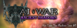
Here’s the result as applied to the main banner on our site:
That’s way stronger than the old Ancient Shadows logo, and so I definitely wanted to give a special thanks to doctorfrog. All of the images on the site and store and blogs have been updated to use the new logo, and the installers have also been updated to include that. The next beta release of the game will update everyone who already installed the game to have the new logo.
For the sake of comparison, the old logo:


People complain about odd things.
Liked the old one better – had more personality to me. The new font looks like a standard word doc font – boring.
But to each their own.