Release notes here.
Last Reminder About Giveaway
We’re still running our #loveindies giveaway through the end of today. Or really, through “whenever I remember to turn off submissions tomorrow.” Sign up to potentially get a free copy of AI War 2 or Stars Beyond Reach. On the subject of #loveindies, would you mind leaving a Steam review for some/any of our games? It doesn’t have to be much more detailed than a thumbs up, but if you like a game we made and want more people to find it, that’s how you make it happen. Like most indies, we could really use the support. Reviews make a material difference in pushing us out of the obscurity of the sludge that often surrounds indie titles on the storefront these days.
Please note that you don’t have to leave a review in order to enter the giveaway; and you shouldn’t leave a good review if you don’t think good things. Reviews don’t help your chances in the giveaway, blah blah blah let’s just clearly keep things ethical.
About This Release
Okay! Now on to the actual business at hand.
- There are a couple of bugfixes in here, although nothing really groundbreaking. Not a whole lot of content on that front, but some good bits.
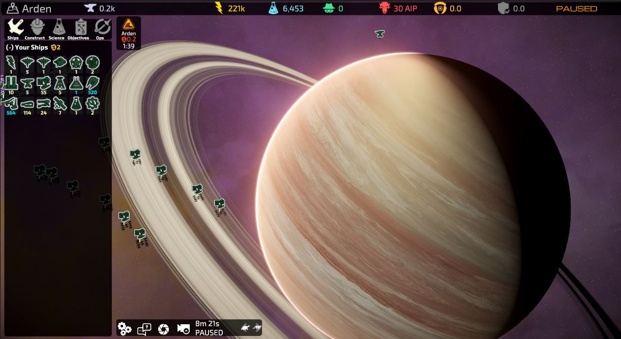
- The main planet view GUI itself has been HUGELY rearranged in order to be more usable and to block less of your view.
Regarding the new planet view GUI changes, one of the things I want to remind you is that it will definitely feel awkward at first if you’ve been playing the game and got used to the sidebar being on the right. And, to head off any potential controversy: yes, if people really freak out about this, we’ll change it back.
THAT said, having this on the left actually makes a lot more sense, as has been pointed out to me recently. Your eyes have to do less work, the overall interface reads in a more sensible order, and so on. I’ll be honest that I’m still getting used to it, myself (it’s been all of a couple of hours for me that this has been on the left, and none of that was really playing the game, just testing the gui). It feels strange, as all change does.
My guess, though, is that if someone comes to the game cold, they’ll not find it strange at all, and it’s demonstrably more convenient in its proximity to the tooltips and general eye gaze.
Less controversially, the top bar has been ergonomically compressed in a helpful way, the ships sidebar lost some elements that were unused or just plain cluttery, and the concept of a galaxy map minimap is something that I’m discarding because frankly I don’t have time to do it while polishing everything else, and it takes up too much space. It doesn’t feel needed.
Overall, your view of the screen is now a lot better, and you can always tell what planet you are at easier, too. Even if we move the sidebar back to the right, those other bits were a win. Oh –and regarding the sidebar, I’ve figured out a new sizing technique for it that is going to be key in some of the lobby work I have planned, too. So that’s really really good.
Quick reminder of our new Steam Developer Page. If you follow us there, you’ll be notified about any game releases we do.
Enjoy!
Chris

