It’s been a busy two weeks! This is the game at 14 weeks of development. The new screenshots are on the official AVWW page, and here’s the new video:
Here’s a quick rundown of what is new since update #9, followed at the bottom by a few longer explanations of some of the items (overworld maps and soft focus in particular):
The Executive Summary
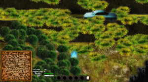
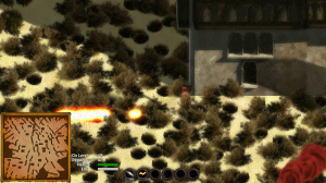
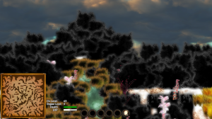
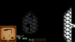
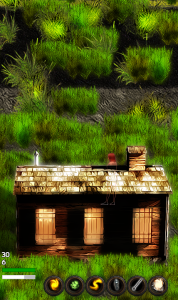 The most visually apparent change is the new soft focus style around the entire game. It makes our colors more saturated and dramatic, it ties all the elements together, and it’s really a big improvement.
We’ve also hugely redone the way that overworld sections work, and it’s way more varied and interesting now — marrying some procedural techniques with some aspects of hand-crafting.
And last but definitely not least, we’ve put in a ton of work on crafting, NPCs, settlements, and more — all that “what is my motivation for playing this” sort of stuff, versus the mechanics of how to play.
Overworld Map Changes
* We now have a map editor, which is a standalone .NET 2.0 program. It’s got a variety of functionality for drawing, filling, smoothing, and so forth.
* Overworld chunks now use heavily-randomized maps to generate a structure of obstacles, entrances, lost-in-windstorm points, and open paths. This marries designer creativity with procedural processing, resulting in thousands of possible obstacle setups per individual map; and when combined with the existing randomization and chunk scripts for populating outdoor areas, the possibilities are multiplied even further.
* We now have three maps in six variants, four done by myself and two done by Erik. This already creates a huge variety, but there’s much more to come! Some are very open, and others are more closed and twisty at the moment.
* All of the overworld chunks are now 256×256 in size (many of them were previously 128×128). This is fourfold increase in size, making each tile on the world map something like 2/3 the size of the the entire Zelda 1 world map. The maps that are applied also now make them vastly more twisty, which makes them feel even larger.
* The Ice Age (thawing and regular) now are the first regions to include new “Point of Interest” scripts, which define certain unusual landmarks that are not centered around a building. Very little has been done with this so far, but a lot more will be in the coming months.
* Having a sky visible over the top of a cliff used to be something that was more limited and which was built into the chunk script itself, but now it’s randomized by region type and these can appear at any time. This makes for less duplication of chunk scripts while still providing more variety. These also dynamically combine themselves with the overworld maps, making for even more variance.
New Entities And Background Tiles, Etc
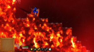
* We now have both flowing water and flowing lava in many chunks (lava only in the lava flats, and with three different visuals possible all in one chunk), and these are presently always bordered by one of six different kinds of sedges (plants) for water, and one type of burnt-sedge for the lava.
* We now have a new shadbush obstacle type that is used in places like the woods and small towns.
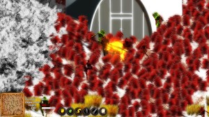
* We now have a new winter mahonia type of reed, which is dramatic bright red and now used in the ice age in some circumstances around buildings.
* Added in a new Weed Patch type of plant, which is a tall and imposing sort of armpit-level undergrowth that you can walk through. Presently this is limited to Small Town areas; some are absolutely plastered with it, while others just have a few spots of weeds here and there. It really differentiates them more from other areas now.
* Added two plum trees and one walnut tree, which can be seen in the various grasslands areas (walnut trees mainly in the grasslands-with-tree-clumps regions).
* Added about sixteen new vehicles (including new ice age futuristic cars), including many more that are broken, flipped over, etc.
* Added three new “factory stacks,” and some concrete barriers, that currently show up in the junkyard and later will be used elsewhere.
* There is now a second type of sky, in addition to the one we’ve had since the first developer diary!
* Added in a higher-level new The Deep region, which is an evil place filled with pulsing darkness. We’re not going to be showing screens or video of this, players will have to find them in-game on their own!
* There are now chasms, rocks, and large birch bushes that work as obstacles on the world maps in addition to the aforementioned lava and water. The south, east and west sides of the chasms aren’t completely polished yet, but they’re getting there. Most of the angles and the north are the way I want.
* There are now shortswords, broadswords, and rapiers in addition to longswords, and they all handle a bit differently (stabbing versus slashing, speeds, powers, etc).
* Three massive new ice age fossils are now seeded as occasional “points of interest” in the ice age regions. These are a good example of something that is interesting but which isn’t a building, which serves as an anchor point on the map.
Minimap Improvements
* Dropped item bags (that a player intentionally put down, or dropped when they died) now show up as a blinking orange blip on the minimap, so that they can actually be found again in the middle of large chunks.
* The minimap now shows obstacles as dark tiles, aiding in actually finding your way around. Additionally, trees, hatches to the underground, vehicles, shipping containers,and roads all show up as a middle-dark color, adding extra shaping and information to the minimap. All of this is only shown in parts of the chunk where you’ve actually found the Point of Interest that reveals that section, of course.
* There are now three sizes of minimap that can be toggled through using the M key (128, 176, and 256). 128 is the old size, and 176 is the new default. Personally, on my really large screen I really like the largest minimap size. It’s really easy to see a ton of detail even in giant outdoor chunks on it, now.
* The player dots on the minimap now blink between a larger state and a smaller one, making them MUCH easier to see and find.
* Entrances are now shown in the minimap, instead of explored points of interest (which are mostly pointless to show, anyway). The entrances are now shown in full red, rather than light red, so that they are much more visible, as well.
* The region level is now shown in the in-game hud (that’s pretty important info!).
Settlements And NPCs
* Settlements are now a part of the game, which is a huge step forward, although they are fairly simplistic so far.
* NPCs who live in settlements can ask you to forge a safe path (using wind shelters) between their settlement and another nearby settlement.
* NPCs can now ask you to clear the area of monster nests to protect the settlement they live in, in order to gain more trust for them.
* NPCs can now ask you to explore nearby regions to their settlement, providing them with some degree of protection from the unknown.
* NPCs can now ask you for a certain quantity of an item (which if you don’t give them, they probably will eventually get on their own, anyway).
* NPCs in general now have an underlying system of hopes and needs, and they have intermediate goals along the path to their hopes. These are things that can be accelerated by your intervention, but many of these are also things that the NPCs will eventually solve on their own without your help. So you can help out where you want, without being forced to babysit a guy who wants to be a better blacksmith or whatever, if you don’t particularly care about his smithing ability. But if it’s useful to you, you can help him along much faster!
* Characters now have crafting profession tiers, and get more proficient with crafting through various means (as hinted at, above).
* NPCs are now able to migrate from one chunk to another, useful for when they agree to migrate to a settlement (which you can now do, in a testing sort of fashion that’s the basic framework for what we later have planned). They do this only after you’ve also left the chunk they are in.
* A lot more internal work on the state of NPCs in general is now in place.
* NPCs can now have various personality traits that affect their hopes and needs, such as professional pride and protective, as the two we’re currently working on.
* NPCs now have an interest in actually building up their settlements, and there are now those with a Builder interest that build small homes and bunkhouses for other NPCs to live in.
Crafting
* There are now a variety of metal and crystal material types, all used for crafting different kinds of weapons and equipment.
* All of the various spells and equipment items now have some sort of crafting recipe that can create them. And in the case of physical weapons like swords, etc, those have multiple metal tiers at which they can be crafted in.
Gameplay
* There are some “monster nests” that can now be found around the world, and which spawn monsters.
* It is now possible to Wait on the world map, advancing the windstorm counter by one, rather than having the only way the windstorm counter decrements be to move.
* Added a new Light Snake ability to the third ability bar. It replaces the idea of the light tracer, this time with a slower, snake-like stream of particles that move past obstacles and then clump somewhere. The snake lasts for 10 seconds and casts quite a lot of light as it moves. It has a very long logistical recharge time of 15 seconds, though, as its main cost.
* More work on the melee weapons and effects, but it’s not quite there yet. We are now planning all manipulation of swords and such to be telekinesis-based, which we have some cool effects for, but it’s only partially implemented.
* The system for cooldowns has been made vastly more robust, and now prevents things like spamming the healing while also mashing the attack buttons. You have to actually be strategic and thoughtful with things, now!
Visual
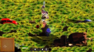
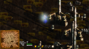
* Pretty much ALL of the in-game graphics have been post-processed with a new Soft Focus effect that makes the entire game have a super attractive (to us, anyway) stylized color that also is much more cohesive. Boy is this a big difference all throughout the game.
* Graphics for the twigs in the lava flats have been replaced with vastly nicer-looking burnt-bushes.
* The lava clouds in the lava flats area are only half as intense as they were before, aiding visibility and making it look nicer in general.
* The visuals for roads have been upgraded somewhat.
* The way that bushes at the edge of cliffs are done has now been completely changed — they are no longer immobile, and are now glowy and evil looking (what I’ll call “The Deep” look). I’d always intended for it to be the case where the earth was pulled down into a supermassive chasm where the sky is visible, partly by the force of evil plants, and now they look it. 🙂
* There’s a very cool new heal visual effect.
* Lots and lots of spell effects have been rendered out, although they haven’t been coded in yet. Coming soon! 🙂
* The new lighting model now has dimness in the center eyesight areas, like the simple eyesight model does. I had thought it couldn’t be done, but it turns out it sure could! It’s quite a big improvement, as players had suggested it would be. 🙂
* Also visuals for several new kinds of enemies that we haven’t had time to actually add to the game yet (giant amoeba, etc), but which look cool. Also coming soon! 🙂
* The player ghost and player bones states now have an animated “spirit fire” effect.
 * Characters now glow with a color that is relevant to their spell as they cast spells.
* Finally got around to updating the remaining world map icons that were still painterly.
* There are some other new ground backgrounds, such as the pine needles in the evergreen forest areas.
* Espers are now ghostly white.
 * Player characters, NPCs, player bags, and dropped items all now have a new ShouldRenderOverlay property set on them, which makes it so that their outline is always drawn on top of themselves (using the new HardOutline), which gets drawn after basically everything else in the game. This makes it so that you can still see the outlines of these things from behind solid objects, grass, or whatever else.
** The MustBeVisible property has been taken off these objects, and the Sparkle ongoingcondition is now gone from the droppeditem object.
** I’m undecided on whether to always have this be on for player characters or not, as it can be a bit annoying/disconcerting in grass or shadows, but for dropped items this is definitely the way to go instead of the sparkle — and at worst I would relegate this to a settings option, since some players have specifically asked for it.
Non-Visual
* Improved the AI for wandering enemies such that if they are stuck at a specific point for more than a quarter of a second, they’ll choose somewhere else to go.
* Several performance improvements have been made; it was already a really high-performance game, but this fixes some relative slowdowns with high-grass areas and with chunk-gen.
* Lots and lots of name files have been prepared by Erik, ready and waiting for new character sprites of different genders, ethnicities, and time periods.
* World files are now compressed to disk in a very CPU/RAM friendly way that shrinks each chunk down from 1.8mb to about 22kb, on average.
* Plenty more music and sound work, as usual! In particular there’s been a big batch of sound effects this time around.
More About Soft Focus
All along I’ve been trying of course to make a unified visual style for the game, and the chief way that I’ve been doing that has been with the painterly style on all the sprites. That works very well, but that’s detail work and only shows up in full-size screenshots or really uber-detailed video of the sort that youtube doesn’t really do. Or any other streaming service.
What that has left us with is something that doesn’t really reduce well at all, and my main way of trying to combat that was with special effects. Again, that was working pretty well, and certainly explosions and fireballs draw the eye. But we can’t have those in every last screenshot, and it doesn’t really help with the overall perception that the art just looks kind of cheap.
This is ironic because, even though the art is actually commodity models rather than custom ones, it’s the sort of models that are unsuitable for games because their polygon counts are too high — they have above average detailing, higher than something like Crysis, even, in many cases. The state of raytraced modeling in non-realtime formats is just lightyears beyond anything that can be done in realtime raster formats (aka games), and that’s something I thought I was taking advantage of pretty well — but again, it doesn’t reduce well, and everything in the game is pretty small despite being a lot more HD-sized than most other games out there that are sprite based.
So I had been thinking about about two weeks ago, and I was looking at the latest raytraced art by one of our community members (eRe4s3r), and I was for the jillionth time thinking how annoying it was that since I’m rendering all these objects into sprites, I lose a lot of the advantages of raytraced art such as having cross-object dramatic lighting, ambient occlusion, and so forth. A lot of those effects are what really make eRe4s3r’s images “pop.”
And that’s when it hit me: in a macro sense, it’s not so much the fancy effects, as it is what it does to the color value of the image, and how that color interacts with nearby objects. What makes that image so darn attractive, even when it’s tiny, is that the colors are really stylized and over-dramatic and saturated. I’d originally been going with a down-saturation look for AVWW, thinking of Silent Hill mostly, but that was a big mistake as it just makes things look bland. Silent Hill is an awesome game, but it looks bland — that’s part of what makes it feel gritty and scary. But that only works in true 3D, I think. Bad role model.
Anyway, long story short, what I’ve wound up doing is basically doing a “soft focus” effect on all the sprites, which accomplishes two things. First, within each sprite it adjusts the colors so that they are over-dramatic and heavily stylized, while still keeping the underlying shape and brush strokes. In the case of some of them, it makes them overly dark shapes, but that sort of contrast and attention to overall form rather than detail actually serves the game well, I think. That can’t be every object, but it works well when it’s about 10% of them. Secondly, it also applies a bit of a Gaussian blur haze around each object, such that it almost seems to “bounce” its color to nearby objects — mimicking ambient occlusion without actually using it (since we can’t in any realtime game prior to DX11, and that’s only for basically Crysis, anyway). This helps to tie each object to its surroundings a bit better than before, which is something I’d really been struggling with for the buildings in particular.
All in all, this creates a style that minimizes better, in some cases much better, aside from looking much better full-size. The colors are more attractive and vibrant, and the overall style of color hues has more in common with games like Bioshock and Crysis than they do with any 2D games I can think of. I was also inspired some by the Death Rally remake on iPhone, the screenshots of which really make me salivate. In some respects, this new style is a bit over the top and surreal, sort of like the Twilight sections of Zelda: Twilight Princess.
So this is a real departure in overall visual tone and look, but the staff has been really excited about it, which bodes well. And personally it’s the sort of thing that I’m just gaga over, I just can’t get enough of colors like that!
More About Overworld Maps
Previously, an individual chunk only had two levels of detailing: it had a general “chunk script” that it would follow, which is a dynamic very-broad-recipe for chunks that players can create and which we also create; and it had sub-scripts for creating buildings and seeding stuff around them.
This was okay, but it tended to lead to chunks that felt big and empty. Really, they also felt smaller than they were, because the shortest path between two points was always basically a line. It wasn’t a very creative use of the outdoor space (but hey, that hadn’t originally been planned to be the end state for outdoors areas, anyway).
Now what we’ve added in is a third layer of detailing, with a fourth coming soon. The third layer is the overworld maps, while the upcoming fourth will be the “points of interest seeding” that I talked briefly about above. More on that in another week. The overworld maps alone create a massive change to the feel of the overworld areas, making for blockages and dead-ends and paths you have to explore to find your way through.
For instance, it’s possible to have an area on the screen that you can’t get to without finding a long way around, which is new for this game (not that new in adventure games overall, of course). Now it’s also possible that there are only 1-4 exits from a given chunk to the overworld, so when you get lost in a windstorm you might be really lost; it’s no longer a simple matter of walking in any direction and living until you escape.
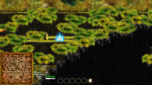
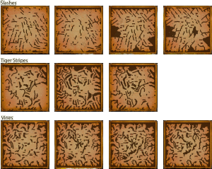
Here are some examples of how a single map from the map editor can vary in even the broadest senses:
There are four examples each of the Slashes and Vines map types, and three of the Tiger Stripes map type.
Most of the dark areas on the map are obstacles like water, lava, rocks, chasms, or bushes — that is randomized and you can’t tell from just the minimap — but some of the big areas that are completely blocked are actually sections that are completely surrounded by such obstacles, and which are thus inaccessible to the player. These sections won’t have any buildings or anything else useful in them, and so the player doesn’t lose anything by not being able to get into them.
Another thing you’ll notice is that along the top of some of these maps there is a “hairy” line — Slashes 2-3, Tiger Stripes 1-3, and Vines 3-4. Those are actually cliff edges to open sky, with the evil black plant tendrils being the hairy lines in question. Those open sky areas were not defined in the map editor, but get seeded in randomly depending on the type of region the map is being used in (a lot of things vary by the region, such as even what sort of obstacles are employed, and a single map could be used in many regions). All of these minimaps are from thawing ice age plains, which has a very high chance of open sky cliffs, which is why you see so many of these having them.
You’ll also notice that some of these are very open, and others are very closed. Slashes 3-4, Tiger Stripes 2, and Vines 1-4 all are the closed variants of themselves. In these closed versions, there is a 50% chance of having only a single exit from the entire chunk, and a 50% chance of having 2-4 exits. There is only ever one entrance to an outdoor chunk, period — you always come in the same way.
But whether that is the only way out, or whether there are a few other exits, is the question. Of course, in the Open versions of the maps, there are quite a few ways out of the chunk.
All of that was just speaking to the very broadest level of description about the chunk — the new overworld maps. Then of course the pre-existing two layers, the chunk scripts and the sub-scripts, kick in. That’s where you see all those little details on the minimaps: the little rectangles with red dots are all buildings of some sort, and you can see how widely they vary in their position. The little white dots are all monster spawners. And the various lighter gray shapes are things like trees, vehicles, and other destructible obstacles. If there were any roads in these sections (which there aren’t), you’d also see those in light gray like that.
So. As you can see, there’s now a much larger amount of variance in how the surface regions get constructed. All of these are just from three maps alone, all in a single chunk with just I believe one chunk script and maybe two sub-chunk scripts. That’s a huge amount of variance from relatively few inputs, because each type of input is so randomized in and of itself. And as we — and players! — add more and more inputs — more chunk scripts, more sub-scripts, more maps, and the upcoming “points of interest” scripts — the amount of variance is just going to skyrocket even further. This is a good example of the power of combining hand-crafting techniques with multi-layered procedural techniques!
More About Surface Region Sizes
In the past, most of our chunks were sized at 128×128 tiles. Each tile is 64px square. The various “hostile” chunks were sized at 256×256, however, to make it harder to quickly escape from them when you could just run in a straight line to get out from any side.
Now, of course, the chunks are twisty and sometimes labyrinthine, so it’s always slower to escape from them, anyway. So did we shrink the hostile chunks?
Of course not! We instead increased the size of all the outdoor chunks to 256×256, making that our new standard. The primary reason for this is space for buildings — I was finding that in maps with any degree of twisty passes, there just wasn’t enough room to have buildings in unpredictable locations. You’d wind up with the buildings always clustering on the right, or whatever, which made the maps not seem very varied.
Bumping the map size up 4x, from 128 to 256 squared, solved that problem really nicely, as you can see from the example minimaps above (as well as the minimaps in the video). This means that all of the non-hostile outdoor areas are now nominally four times larger in area, but really the feel of it is that they are 10x larger or something along those lines.
The reason is simple pathing: before, to get from point A to point B, it was always a line you’d walk in, except to go slightly off the line to go around trees or buildings. Now it’s sometimes a very complex and maze-like situation to get from point A to point B, which means that the distance you have to travel to get from point A to point B might be much further and more interesting.
None of that is exactly ground-breaking for adventure games, as they all use the same techniques in terms of breaking up the landscape. All the way back to Zelda 1, you see that sort of pattern. But it’s new to this game this week, and it’s really interesting to me to see how much that one simple change really transforms the entire feel of playing the game.
Speaking of Zelda 1, there are some interesting size comparisons to be made. Zelda 1 had 8×8 pixel tiles on each screen, and each screen was 32×22 tiles in size. So that’s 704 tiles per screen. AVWW has 64×64 pixel tiles, and a 1280×1024 screen can show 20×16 tiles at once. So that’s 320 tiles on the screen at once — there’s a lot more detailing on each tile, obviously, given that each of our tiles has sixty four times as many pixels as a Zelda 1 tile (8×8 = 64, 64×64 = 4096).
So in some senses it is a little more “zoomed in,” but you’re also getting a lot more detailing on each tile. It’s interesting to note that the beloved Zelda: Link to the Past made the same decision: it moved to a 16×16 tile size, four times larger than that of Zelda 1, and it could show 16×14 tiles on-screen at once (the SNES output resolution was 256×224). That’s equivalent to playing AVWW at 1024×896, which is still plenty zoomed out for both AVWW and Zelda 3.
Okay, enough about screen resolutions — let’s talk about map size, which is actually a lot more interesting. So, Zelda 1 had 704 tiles per screen. The entire Zelda 1 overworld was made up of 16×8 screens, so that’s 90,112 tiles in the entire Zelda 1 overworld. Since the AVWW surface chunks are now 256×256, that’s a total of…65,536 tiles in a single surface region of AVWW. Note that each tile on the world map of AVWW is a region. So by the time you’ve traversed two of those regions, that’s more surface area than the entire Zelda 1 overworld.
To those who had worried that the surface chunks seemed a bit on the small size (at 128×128, that would have been 16,384 tiles per chunk), that’s definitely no longer the case! Not only are the chunks now more twisty and interesting in their shapes, they are also now larger and have more stuff in them. And we’re only going to be packing in more and more stuff per chunk, too, which is a big part of what’s coming up for us in the next few months.
Until Next Time!
Lots more coming down the pipe soon, as always. Keith is hard at work on NPCs, settlements, and that sort of thing. I’m doing more stuff with chunks and seeding, and then moving into underground areas and interiors again, as well as some more spells and art stuff. Pablo is hard at work as always on music and sound. And Erik is working on more maps, “wiring up” new objects that I do the art for, more randomized names for things, and so on. Stay tuned!



Chris, these are some massive updates. I wish more devs included this much info in their updates.
If I may, however, make a suggestion: how about a quick summary at the top of the post bullet-pointing everything covered; it would make it easier for people to get a quick overview of the changes if they’re short on time or skip to a section they’re most interested in.
Good luck with the game!
What is the price point of AVWW going to be at release?
Lusit — that’s not something we’re able to confirm with any definite-ness yet. But most likely $9.99 for a short while after it goes beta, then probably $14.99 for the remainder of beta, and $20.00 at 1.0. But that’s subject to change.